
Data Visuals that Amplify Your Mission
Signalform helps nonprofits and purpose-driven organizations convey complex information with visuals that inspire trust.We transform data, knowledge, and impact into visuals that resonate — reports, infographics, diagrams, and decks that give your work credibility with boards, funders, policymakers, and the public.Explore our offerings below — or just reach out. We’d love to collaborate.

To anchor this strategic plan spread, a bold line chart shows the rising influence of money in politics—the driving concern behind the advocacy org's core mission. Surrounding infographics and photography were woven into the layout to build a visual narrative that’s both informative and emotionally compelling.
Data-Forward Strategic Publications
Smart, visual-forward design for documents that communicate strategy, from one-pagers to full-length reports. Might include:
Document Design and Layout
Charts and key data visualizations
Diagrams, timelines, and theory-of-change visuals
Whether it’s a strategic plan, program overview, or milestone report, these documents shape how funders, board members, and partners understand your work. I help ensure they’re readable, compelling, and visually aligned with your mission, and integrate data and diagrams to professionally communicate your big ideas and achievements.
Mission Infographics
A clear, designed visual piece that explains your organization or a key program: what it is, how it works, or how it’s grown over time. These materials blend structure, story, and data into a single visual language. Might include:
Narrative infographics showing growth or evolution
“How it works” diagrams, org charts, or logic flows
Modular graphics for decks, social media, or onboarding
Data visuals and branded elements
Perfect for quickly communicating the most central story.

To help the college celebrate its 10-year milestone, I created a visual piece that distilled key moments and metrics into a single, cohesive story. Designed for quick comprehension, with hierarchy amidst details, the graphic has been used for various external communications.
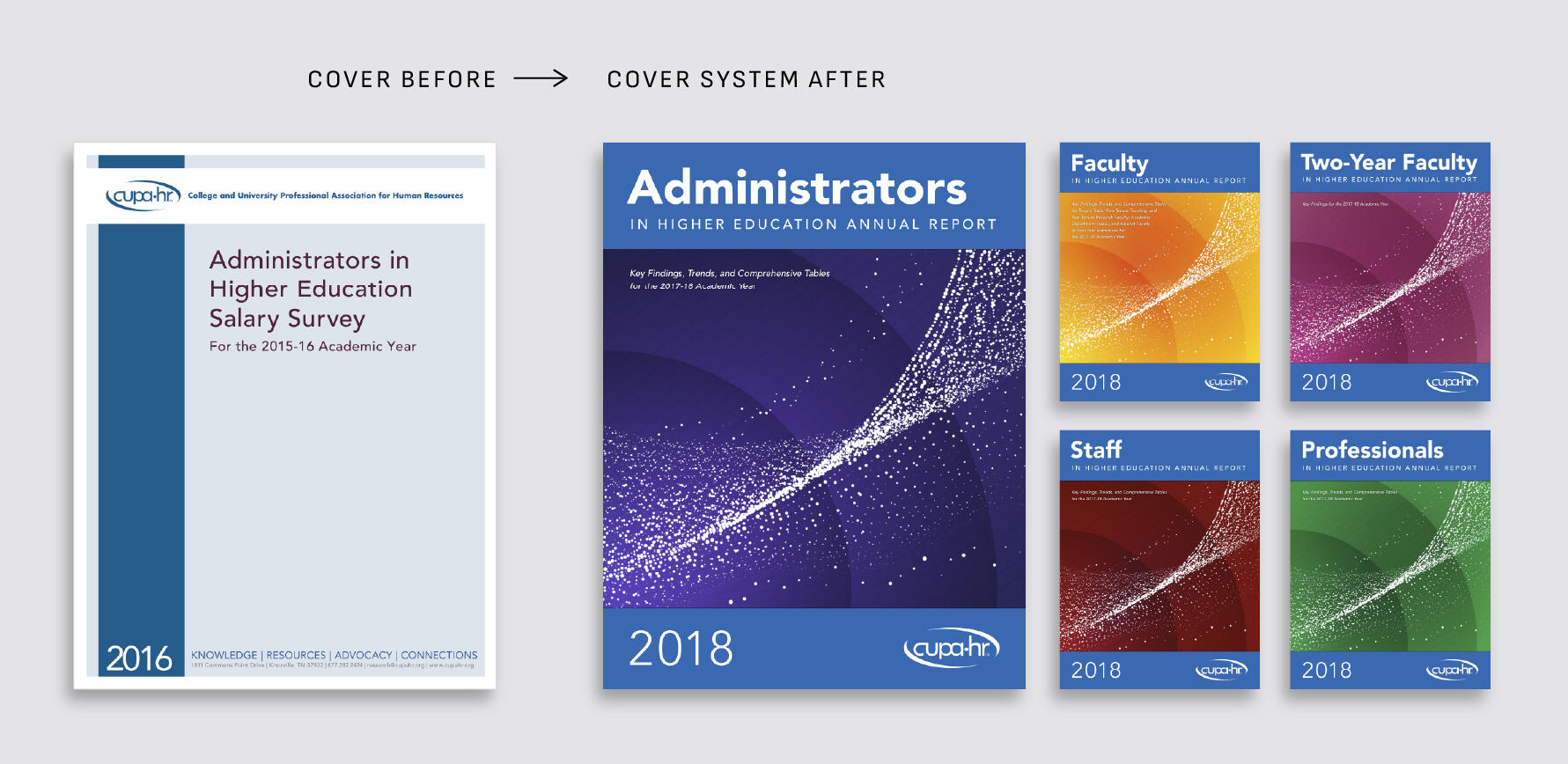
These annual reports were originally built in Word with minimal design. I created a cohesive cover system that unified the publications through branding, structure, and visual continuity.
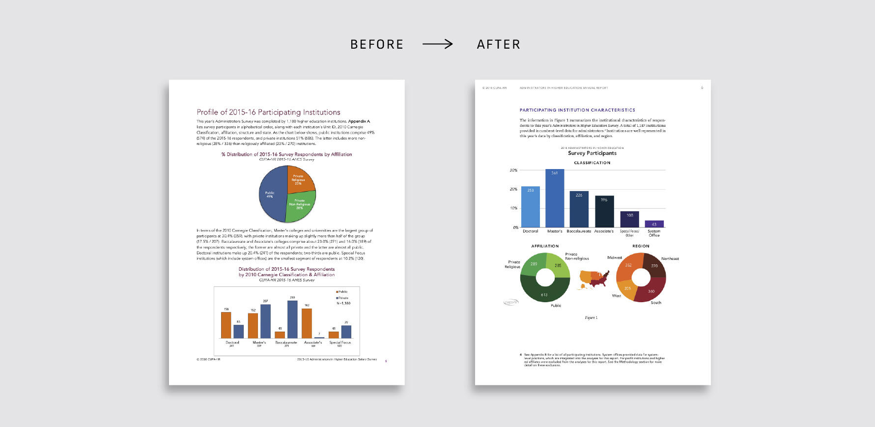
A clean grid, strong typography, and integrated charts replaced the loose, Word-style layout—turning the page into something both readable and polished.

Different chart types, one visual language. With rules for colors, labels, grids, and layouts, every page looks coherent—and can be recreated reliably year after year.
Data Design Framework
A tailored visual system for your charts, graphs, and data-driven materials — built for consistency, clarity, and trust. We extend your existing brand into a clear, flexible structure that works across real-world formats: reports, slide decks, infographics, and more.What's included:
A Style Guide for Data – visual standards for charts, typography, and layout
Templates and Examples – ready-to-use files and copyable visuals
A Cohesive Visual Language – integrated with your branding and report design
Many charts are thrown together last-minute, using whatever tool is at hand — resulting in off-brand, messy visuals that undermine your credibility. A visual reporting system makes your data look as strong and strategic as your mission.
Spreadsheet to Story
You bring the (messy) data, we’ll turn it into insight. Most organizations have information, but not clarity. Whether it’s scattered spreadsheets, inconsistent reports, or legacy dashboards nobody trusts, we work with what you already have — no need for a pristine dataset or in-house analyst. This offering combines:
Data cleaning and structuring
Synthesis across sources
Metric creation or refinement
Thoughtful visualization and design
The result? A clear, communicable understanding of what’s going on, whether for internal decision-making, external reporting, or stakeholder buy-in.

This piece distills academic research and complex public data into a clear, visual framework. By grading states and showing comparable metrics, it reveals patterns and gaps in anti-corruption reforms.
You're doing great work.
Let’s share your story through visuals people can trust.
About
Signalform is led by Jasper McChesney, a seasoned data analyst and designer with more than a decade of experience translating complexity into clarity. He has partnered with universities, nonprofits, and mission-driven organizations to turn research, metrics, and strategy into visuals that decision-makers rely on. Jasper’s work draws on technical rigor, design acumen, and a proven track record of helping teams communicate with boards, funders, and the public.
